Why I Start in High-Fidelity
The wireframe is dead. It is literally faster to drag a real button into Figma than to draw a grey box. For anyone working with modern design systems, that changes everything: high-fidelity is no longer the finish line, it's the starting point. [justinmind] ↗
I stopped making wireframes two years ago. I do not miss them.
Why Low-Fi Wireframes Break Down
Classic wisdom: start with low-fidelity to nail structure, then add detail later. That made sense when tools were slow and design systems did not exist. Today, low-fi often just delays the real work. [nulab] ↗
Low-fi hides the actual problems:
- Placeholder text does not reveal label overflow or truncation.
- Grey boxes do not expose density, hierarchy, or readability issues.
- Stakeholders struggle to react to abstractions, so feedback becomes vague and late. [prototypr] ↗
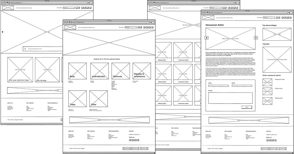
You end up designing twice: first as boxes, then again as the real product. It feels fast, but it is fake speed. [nulab] ↗
Design Systems Make High-Fi Faster
Modern design systems flipped the equation. Dragging a production-ready button into your canvas is as fast as drawing a rectangle, but it comes with real padding, states, and brand styling. [toptal] ↗
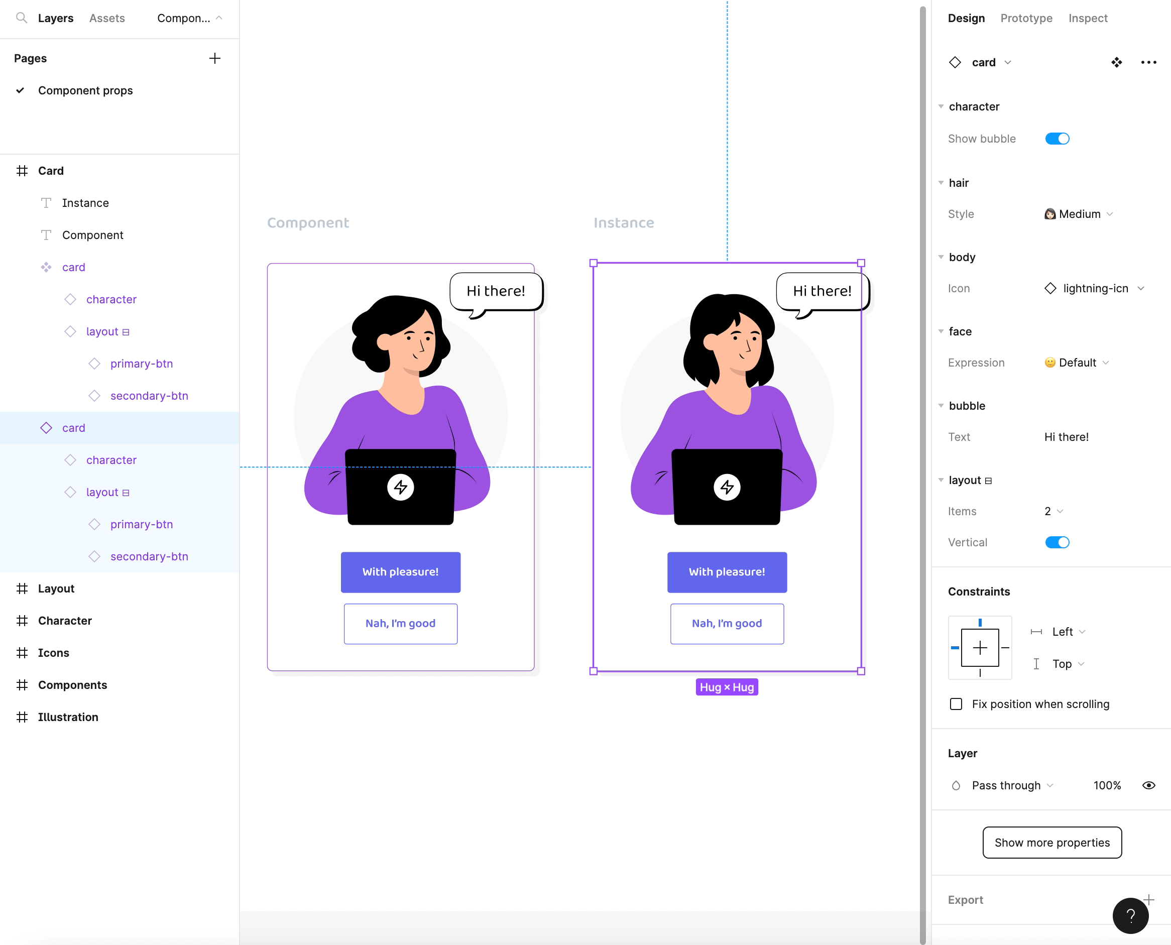
Working from components means:
- You assemble screens instead of redrawing UI from scratch.
- Changes to a component cascade across all screens.
- Real typography, spacing, and color expose issues immediately. [designproject] ↗
Studies and case reports show teams ship faster and more consistently once a design system is in place because they spend time composing, not recreating patterns. [linkedin] ↗
High-Fidelity from Day One = Honest Design
Starting in high-fidelity is not about premature polish; it is about honest constraints.
With real components and real content:
- Density, hierarchy, and scannability are visible on day one.
- Usability tests become more accurate because the thing people see is close to what they will get.
- Developers get a near-production blueprint instead of a loose suggestion. [eleken] ↗
Feedback shifts from "I guess this layout is okay" to "This CTA gets lost" or "This table is unreadable on small screens"—the kind of feedback that actually improves the product. [justinmind] ↗
Vibecoding: Designing by Feel at High Speed
Vibecoding pushes this even further. Instead of starting from boxes or strict specs, you start from a mood and intent: "calm and trustworthy," "playful and fast," "serious and high-stakes." Tools and AI help you remix components, layouts, and styles until the screen feels right. [uxtigers] ↗
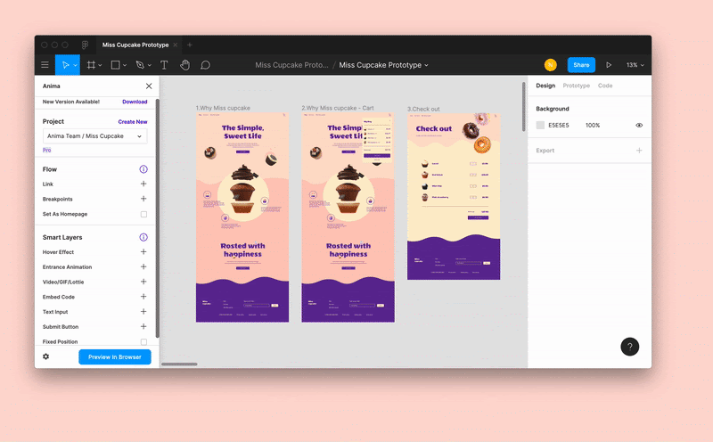
Combined with a design system, vibecoding means:
- You prototype multiple directions quickly without rewriting everything.
- You tune spacing, color, and motion live, in high-fidelity.
- You prototype interactions in under 10 minutes! [figma] ↗
You are no longer wireframing a structure; you are sculpting a vibe using real UI.
When Wireframes Still Make Sense
Wireframes are not useless... they are just niche:
- Very early, blue-sky concepts with no system in place.
- Fast mapping of complex flows before any components exist.
- Workshops where fidelity would distract from the conversation. [hubspot] ↗
For most product teams with a functioning design system, though, wireframes are overhead. High-fidelity plus vibecoding lets you move faster, see problems sooner, and ship interfaces that match how the product will really look and feel.