Improving Adoption by Reducing Onboarding Friction & Accelerating Time-to-Value
Despite strong word-of-mouth around Syllabot, most new users struggled to create a functional bot, thus, affecting adoption.
The platform offers powerful features but has a steep learning curve. New users, mostly faculty and staff, landed on an ambiguous dashboard, couldn't find Syllabot, and froze during setup. The platform's complexity wasn't the problem; the lack of guided onboarding was.
My goal: re-architect the first-time experience to reduce cognitive load, guide users through a complex workflow, and communicate value immediately.
TL;DR
- Problem: New users struggled to create functional bots due to ambiguous dashboard, unclear entry points, and lack of guided onboarding.
- Solution: Redesigned hero section, created Super Templates with guided workflows, implemented early knowledge upload guardrails, added quick access buttons, and integrated demos with optional live support.
- Impact: Transformed onboarding from "feature-first" to "value-first" approach, reducing cognitive load and accelerating time-to-value.
- Approach: User research, competitive analysis, and progressive disclosure principles.
Problem: A Predictable Failure Path
The core issue wasn’t that users lacked motivation or technical skill; it was that the system didn’t communicate where they were, what mattered, or why. This disconnect meant most first-time experiences collapsed before users reached the value of the tool.
This was consistently observed in user sessions and validated by multiple flow analyses.
Key breakdowns:
- Entry-point confusion: Users arriving for "Syllabot" landed on "CreateAI Builder" and questioned if they were in the right place.
- Template ambiguity: Users didn't know how to start or what "Copy vs Edit" meant.
- Missing dependency awareness: Users proceeded to the chat screen without uploading knowledge files, resulting in poor output.
- No scaffolding: The platform exposed full complexity immediately
This created a loop of:
Research Highlights
I offered demos with faculty, staff, and instructional designers. Firstly, I let them try the product on their own and then provided a guided walkthrough. This gave me critical insights on expectations of the users and their behaviors
Insight
Users who received even a minimal guided walkthrough navigated significantly better, confirming the need for structured onboarding and progressive guidance.
Exploring how other platforms improve adoption and onboarding
Patterns observed:
- Strong "hero" sections with clear starting points
- Onboarding wizards
- Live demo or tutorial support
- Simple starting points to acting as Demos
These studies informed our onboarding redesign.
Transformation Strategy
Goal: Transform onboarding from "feature-first" to "value-first"
Three pillars guided the redesign:
- Surface value early — Clarify what the platform does, who it's for, and how Syllabot fits in.
- Guide progressively — Show only what users need to know at the right moment.
- Make dependencies impossible to miss — Ensure users upload knowledge files before testing a bot.
Solutions
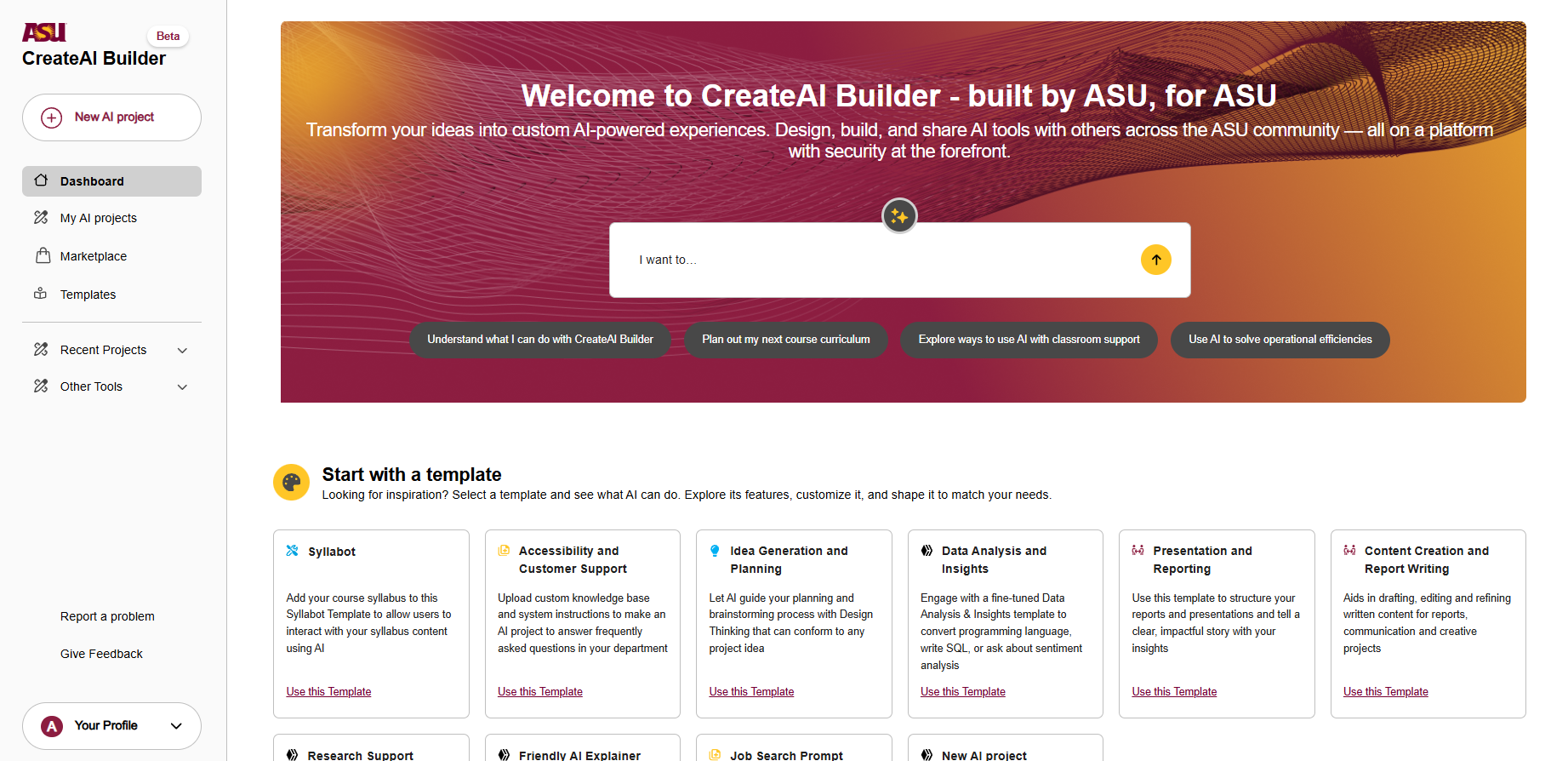
A. New Hero Section: A Clear Starting Point
Why: The old dashboard lacked context/guidance. Users didn't know where to click.
What Changed
- Surfacing Syllabot
- Hero Carousel with Demo Videos
- Community links and access to supporting tools within the platform
- Immediate explanation of "what this product does"
Expected Outcome: Users understand context before interacting with the system.
B. Super Templates: Guided Starting Workflows
Super Templates solve the "lost after clicking a template" scenario by functioning as curated, guided workflows—not blank starters.
Each card now includes:
- Audience clarity (faculty / students / staff)
- Setup time
- Integration badges
- Capability highlights
- Social validation (e.g., "Used in 147 projects")
- Micro demo video
- Clear CTA: Try It Now
This turns uncertainty into confidence before users even begin.
Impact
Templates now act as guided workflows, not generic building blocks.
C. Early Knowledge Upload + Guardrails
Users routinely jumped straight into testing before uploading required files. This led to poor output, and thus frustration. Introducing guardrails at this stage fundamentally changed the onboarding flow by aligning the system’s expectations with the user’s mental model. This moment of guidance prevents early failure states.
Fixes Implemented
- Intermediary setup screen prompting users to add files immediately
- Guardrails preventing bot testing without uploaded knowledge
- Inline demo video explaining why knowledge files matter
- Sample conversation starters to show expected bot behavior
- Progressive disclosure of only the necessary settings
Result: A smoother, dependency-aware setup path.
D. Quick Access Buttons to Reduce Overwhelm
Users repeatedly got lost when they moved to:
- Behaviors
- Knowledge settings
- Integrations
So we added contextual "Quick Access" buttons that take them directly to the relevant setting.
This eliminates any intimidation when they see a settings screen full of complex terms. This prevents confusion and keeps users on track.
E. Demos + Optional Live 1:1 Support
Inspired by h2o.ai and Runway:
- Added micro demos inside templates
- Introduced a "Request a Live Demo" CTA
- This also serves as an ongoing feedback loop for understanding new user friction.
Prototype Demos:
How These Fixes Map to Observed Failures
| Observed Failure (from flows) | Solution Implemented |
|---|---|
| Users unsure they're in the right place | Redesigned hero, clearer branding, Syllabot surfacing |
| Users can't find Syllabot | Super Templates + hero CTA |
| Users confused after landing on project page | Template previews + step-by-step guidance |
| Users skip file upload | Guardrails + early upload step |
| Users test bot without context | Blockers + sample conversations |
| Settings intimidation | Quick-access buttons |
| Users need external help | Built-in demos + optional 1:1 sessions |